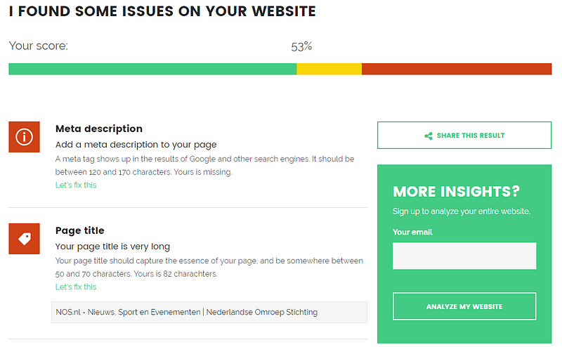
I recently built a website testing tool, www.siteguru.co. After 2 months of developing, I was ready to show it to the world.
Normally, I would launch a big Adwords campaign and email all the blogs I could find to promote my awesome new website. This time, I tried a different approach. I wanted to draw a small number of visitors to my website. Watch what they are doing, and learn from that. The results:
- I validated that people actually want to use my website (Jaaay!)
- I found a huge number of usability issues (and fixed them!)
The best part: it costed me just $100
Showing my MVP to the world
You’ve heard it all before: launch your Minimum Viable Product as soon as you can. Test it in the real world to see if there is a need for your product, and how you can improve it. But how do you do that? Without big budgets for in-depth user testing? Seems impossible? Actually, it’s easy. You need just 2 things:
- A website recording tool (I’m using Smartlook.com but there are various alternatives)
- An Adwords account with $100 (pro-tip: get a discount coupon: spend $40 and get $120 in credits)
Let's go
Here’s how I did it. First, I installed Smartlook.com on my website: a recording tool that shows you how your visitors use your website. You see how they move their mouse across the screen, where they click, and where they pause.
Now, I needed real people visiting my website. I wanted to get at least 10 people to visit my website every day, for 10 days. So I created an Adwords campaign, and I set the CPC to $1 for a couple of relevant keywords and set the budget to $10 per day. Remember, the goal was not to turn these first visitors into loyal, paying clients. I just wanted to see them use my website.
Grab some popcorn
It worked: after starting my campaign, I would get around 10 visitors a day from my Adwords campaign. I would come home from work, grab some popcorn and look at 10 recordings. Every new recording was exciting: did they understand what the website is about? Could they find their way around? Would they sign up?
The good news: people seemed to love my website: I could see them run website checks and take their time to see the results. A clear indicator that there is a market for a simple website testing tool.
Business model validated. Now let’s start improving
Job done? Hell no, I was just getting started! Because looking at the recordings, I could see a lot of imperfections. Sometimes I could see the frustration of users. Things I could not have thought of up front, but which became instantly clear after seeing real people use the website.
One example: after running their first website check (which runs on just a single page), I would invite them to sign up and scan their entire website. The signup form was on the right side of the results. However, as soon as people would scroll through the results, the signup form would quickly move out of sight. Quick fix: make the form sticky to make sure it remains visible. Obvious? Sure. But I missed it when I was testing. Seeing it happen in the real world made it very clear.

Another one: checking a website takes about 15 seconds. I would show a nice loading screen with some inspirational quotes to keep them entertained. That didn’t work. By looking at their mouse movements, you could see people got impatient and often clicked away.
The first improvement was to add the load time to the screen: I would show “This takes about 15 seconds”. Better? Nope. People kept behaving the same way. Next try: I added a loading bar, moving from 0 to 100% in 15 seconds. Immediately I could see from the records that people waited patiently for the check to complete. Again, not something I would have found out without seeing real users in action.

These are just two of many examples. There are many, many more. From a hindsight, each of these usability issues seem obvious. But I’m pretty sure I would not have foreseen them without watching real users in their natural environment.
After 10 days, I had watched 100 people use my website. No expensive usability tests in fake experimental settings: real people trying to solve their real problems.
What’s next?
I’m sure that my website got a whole lot better by observing real people solving real problems. It showed me that there’s a need for a tool like this. Now I feel confident enough to go out there and spread the word!

